_JNavs_ wrote: ↑Sun Dec 04, 2022 8:30 am
I will disagree and say the water paint aesthetic did nothing but embrace the visual beauty of KOTM. Every shot embraced the beauty in the chaos, and felt like renaissance painting after renaissance painting.
2014 on the other hand... I love it to death along with the rest of the MV, but there was about 7 shades of gray at all times.
I watched G14 and KOTM back to back a while back, and I got to say, while KOTM has some fantastic imagery, I think Godzilla 2014 handled the weight and scale of the monsters a lot better. That’s not to say that Dougherty’s approach to the action was terrible. There are definitely some amazing shots, like Ghidorah coming out of the sinkhole in Antarctica and Godzilla arriving at Boston with all of the jets surrounding him.
But IMO, I thought that Edwards handled the cinematography and action with a lot more grace. Even though the lighting in G14 could’ve been better, the monster action leaves a more significant impact on the viewer as it is filmed much slower. For instance, look back at the scene where Godzilla rises out of the water next to the Golden Gate Bridge. From the shot being filmed inside a school bus to the camera slowly panning downward as Godzilla reaches for one of the cables, Gareth Edwards does a great job at making Godzilla look and feel like a living, breathing being with weight. Or how about the scene where Godzilla roars at the female MUTO while she’s laying her eggs? Godzilla slowly making his entrance before bending down to let out a mighty screech, and the female MUTO positioning herself upward before stomping her claws into the ground and walking towards him is masterfully done, IMO.
Not only do the monsters feel more alive, but because they are filmed at a much slower pace than in KOTM, you get to see a lot more of the monsters in full detail. The audience is given enough time to let the monster scenes resonate with them rather than quickly breezing through each scene without taking a breath.
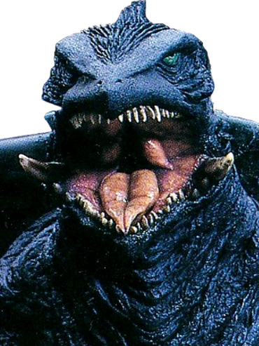
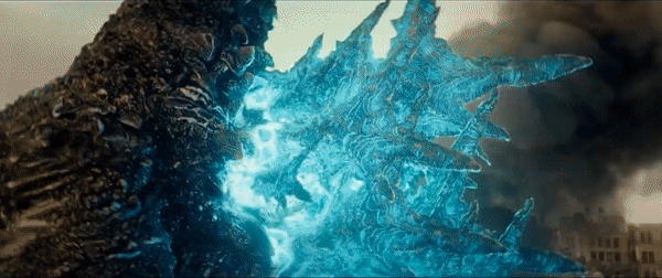
The way KOTM handled its monster action, on the other hand, isn’t as strong, IMO. Because of the inclusion of weather effects like rain and snow, along with the use of blue, green, and orange color grading and rapid editing, you don’t get a sense of the monsters’ scale and weight. I would’ve liked to have seen the monsters in their natural colors because their CGI models are incredible! I understand why Dougherty chose to color-grade most of the monster scenes. He wanted the scenes to look like renaissance artwork. This is evident during the scene where Ghidorah is performing his alpha roar on top of a fiery volcano with a cross standing in the foreground. While I do love the idea behind taking this approach, I think it fell a bit short in its execution. I felt like many scenes with the monsters lacked enough contrast to make the CGI pop. Kong: Skull Island, while being very colorful and lively, balanced out its bright colors with enough contrast and scenes of natural colors. GVK also followed this to a tee, IMO. If Dougherty had taken a similar approach while making the scenes look renaissance-ESC, I think they would’ve looked much better.
Matt Allsopp, a concept artist who worked on G14, drew some amazing key frames of the battles during KOTM. I think these scenes look a lot better than the way they were executed in the final film since they have not only a lot more low-angle cinematography but also a proper balance between bright colors, natural colors, and contrast.


 ___________________________